Vertglows.
vertglows.vercel.app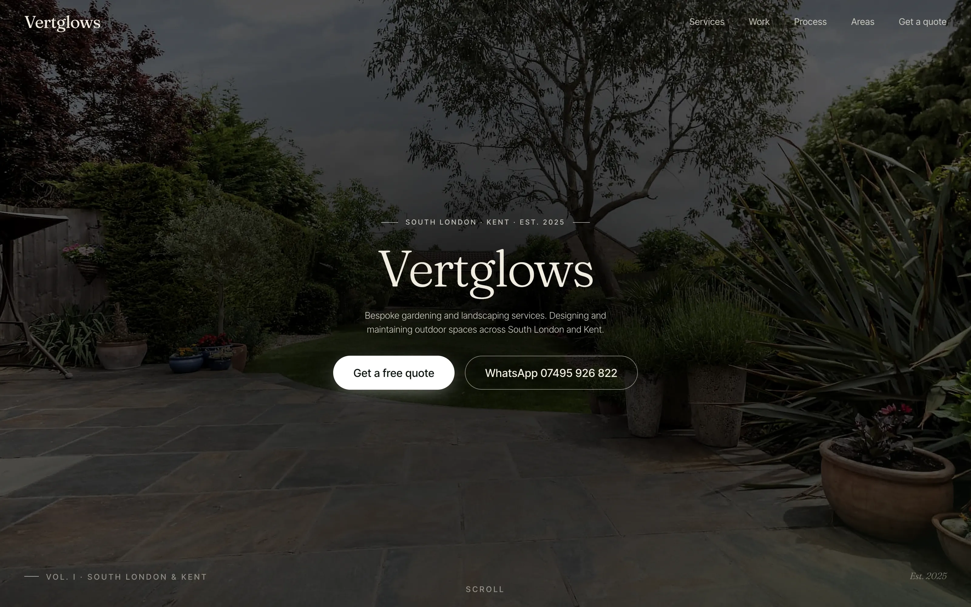
An old school friend, a new business,
and twenty-seven phone photographs.
An old school friend rang up. He'd been doing garden work across South London and Kent for years — clearance, lawn care, hedge cutting, ongoing maintenance — and was finally giving the business a name. Vertglows. He had a brand-new Instagram, a phone full of job photographs, and exactly nothing else. No website, no logo, no brand voice, no Google Business Profile. He needed a site that made the work look as good in pixels as it does in the garden, and a brand that read at the level of his actual craft. The trade-tier sector is a sea of identical Wix templates with stock photos of stranger's lawns. The brief: do not make another one of those.
Stand the trade up
at editorial height.
A dark site for a daylight trade.
Local trade sites are almost always white-with-green. Vertglows runs the opposite: deep forest #0E1812 dominant, warm cream #F1EDE0 body, sage #7A9A6B for eyebrows and links, and a single amber #D9A05A per viewport for emphasis. The garden photography reads brighter inside the dark frame; the brand sits closer to a small wine bar than a man-with-a-van.
Twenty-seven of his actual gardens.
Every photograph on the site is from a real Vertglows job. Hero, four service cards, before-and-after pair, eight-photo carousel, areas section — not a single stock image. Originals were converted to WebP at 1600px and 800px with sharp_yuv encoding, lazy-loaded everywhere except the hero, with explicit width/height to prevent layout shift. The work is the brand.
Italic accent words on every heading.
Fraunces variable italic at weight 200–300 for headlines and accent words; Inter Tight 300/400/500 for body, eyebrows and microcopy. One italic word per major heading — immaculate, workable, scalped, every visit, photograph. The italic does the work an oversized logo would normally do, and the type carries the brand without any decoration.
Eight photographs,
looping forever, framed like plates.
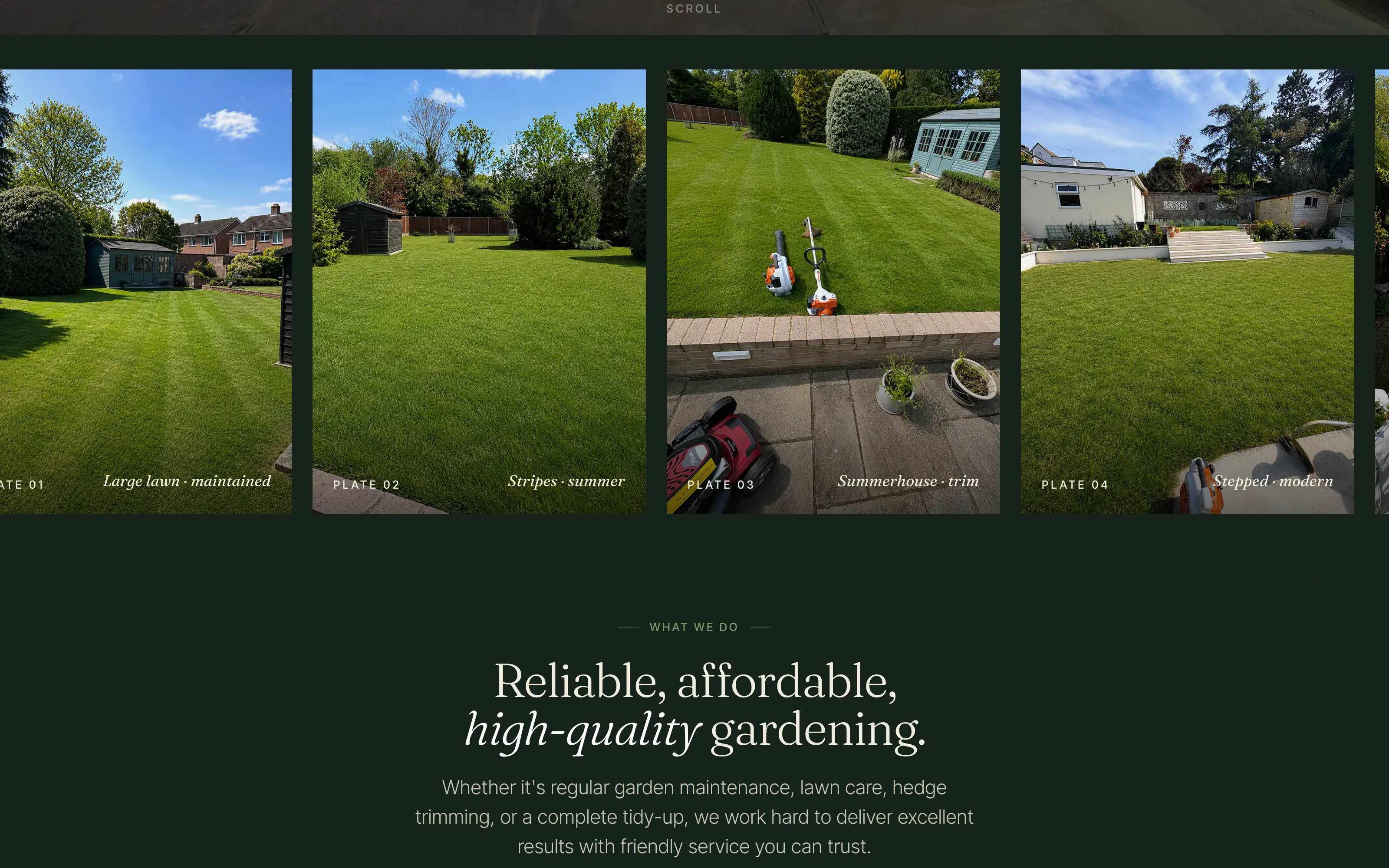
A trade site lives or dies on whether a visitor scrolls past the work. The Vertglows carousel is a continuous CSS marquee — eight unique photographs duplicated once for a seamless seam, always moving, pausing only on hover and on touch. Captions in Fraunces italic sit bottom-left of every frame, like wine list plates: Large lawn · maintained, Stripes · summer, Summerhouse · trim, Scalped · modern. The rail intentionally bleeds past the viewport edges on both sides so the visitor always feels there's another photograph just out of frame.
-
Pure CSS marquee, zero JS for motion.
@keyframeswithtranslateX(-50%),animation-durationcalculated from the duplicated track length. NorequestAnimationFrame, no scroll listeners, no GPU thrash. -
Pauses on hover, touch and offscreen.
animation-play-state: pausedon:hoverand.is-paused.IntersectionObserverpauses when the rail leaves the viewport.prefers-reduced-motionhalts the loop entirely — the photographs stay readable as a static grid. -
Bleeds beyond the container.
width: 100vw; margin-left: calc(50% - 50vw)— breaks out of the centred container so the rail edges off both sides of the viewport. No horizontal scroll triggered on the page itself; the rail handles its own overflow. - Plate captions in the photograph, not above it. Each caption is positioned absolute inside the frame, bottom-left, in white Fraunces italic with a subtle text-shadow for legibility against the photograph. The plate number (PLATE 01) sits opposite for editorial balance.
- 16 WebP files, all lazy-loaded. Only the first three frames render eagerly — the rest fetch as the rail scrolls them into view. Total carousel weight on first paint: ~140KB.
/* styles.css · the work carousel */

.work-rail {
  display: flex;
  gap: var(--s-3);
  animation: rail-scroll
    68s linear infinite;
  width: 100vw;
  margin-inline:
    calc(50% - 50vw);
}

.work-rail:hover,
.work-rail.is-paused {
  animation-play-state: paused;
}

@keyframes rail-scroll {
  to {
    transform:
      translateX(-50%);
  }
}

@media (prefers-reduced-motion: reduce) {
  .work-rail { animation: none; }
}- Unique photographs
- 8 (duplicated to 16)
- JS for motion
- 0 KB
- Pause signals
- 4 (hover, touch, offscreen, reduced-motion)
- Carousel weight (first paint)
- ~140 KB
- Loop duration
- 68 seconds
- Caption font
- Fraunces 200 italic
A dark site for a daylight trade.
And one amber accent per viewport.
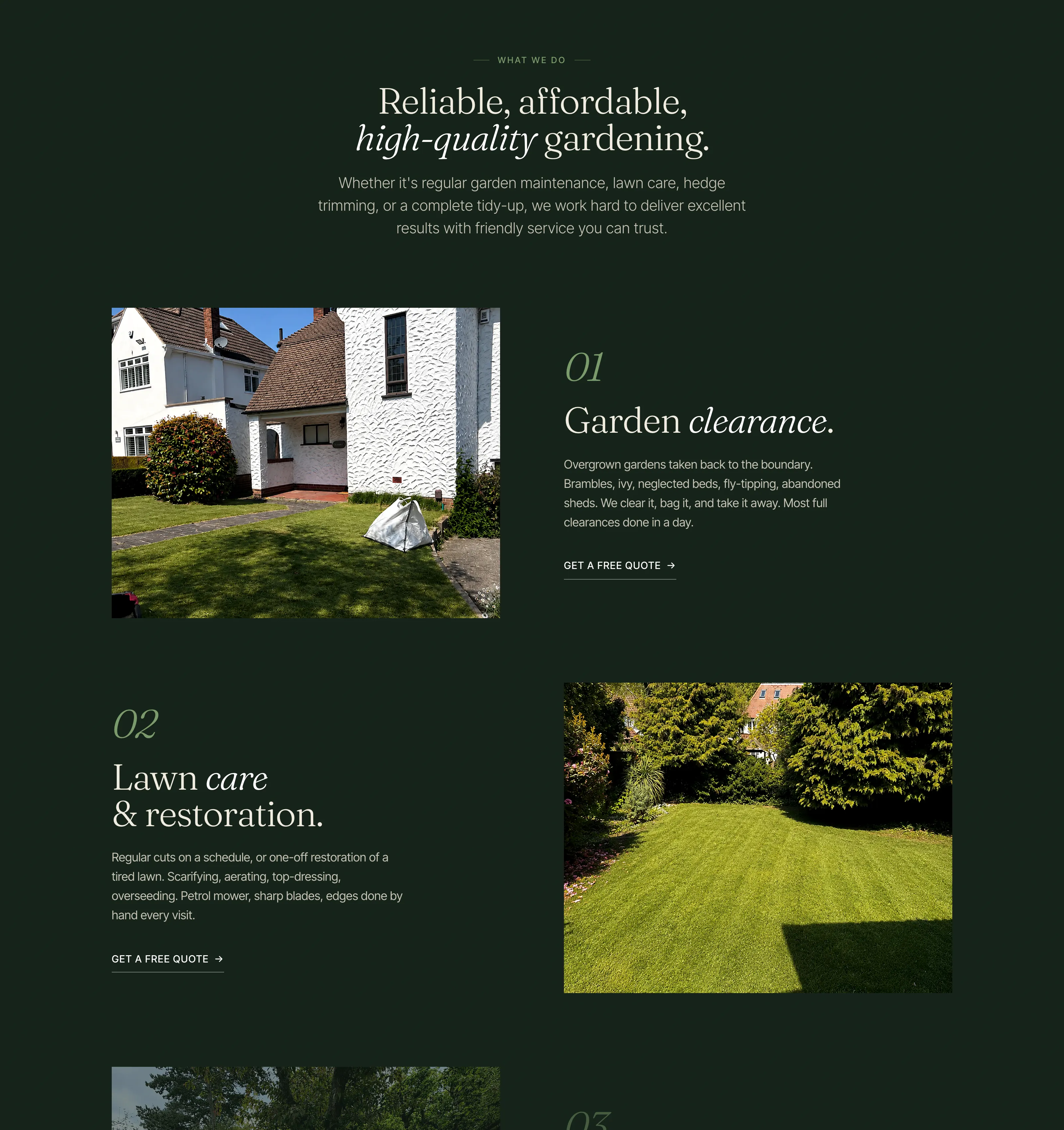
The Forest Glow palette is the whole brand. Dark forest dominant at 60%, warm cream body at 30%, sage and amber sharing the 10% accent slot. Amber appears exactly once per viewport — on the active CTA, on the before/after divider, on the scroll-cue underline. The discipline of "one amber" makes every appearance feel earned. The same restraint runs through type: one italic accent word per heading, never two; Fraunces variable italic at 200 weight for the lightest touch; Inter Tight 400 for everything that has to read at speed on a phone in a parking bay.
- One amber per viewport. A single amber accent at any scroll position — primary CTA, before/after divider, scroll cue underline, plate divider. Discipline matters more than the colour.
- Italic accent words. Each major heading carries one italic word (immaculate, real pride, fixed-price, finish). Fraunces italic at 200–300 weight, baseline-aligned to the surrounding upright type. The italic IS the emphasis; no underline, no colour shift, no decoration.
-
Cream on forest at 14:1.
Body text
#F1EDE0on background#0E1812hits 14:1 contrast — almost three times the WCAG AA threshold of 4.5:1. The dark theme reads cleaner than most light sites. - Sage links instead of buttons. Service cards end with "GET A FREE QUOTE →" as a sage link, not a button. Buttons would compete with the hero CTA for attention; the sage link feels like a continuation of the photograph.
- Variable font, two faces. Fraunces variable + Inter Tight, both via Google Fonts at launch (with a swap-to-self-hosted-WOFF2 path queued for the AVIF re-encode pass). Two faces, never three.
- Page weight under 500KB on first paint. Hero photograph 414KB at 1600px (preloaded), HTML 28KB, CSS 22KB, JS 1.5KB. Everything else is lazy.
/* tokens.css · Forest Glow */

:root {
  /* 60% dominant forest */
  --paper:        #0E1812;
  --paper-deep:   #16241A;
  --paper-bright: #1F3024;

  /* 30% body cream */
  --ink:          #F1EDE0;
  --ink-mute:
    color-mix(in srgb,
      var(--ink), transparent 25%);

  /* 10% accent — ONE amber per view */
  --vert:         #7A9A6B;
  --glow:         #D9A05A;

  /* Type */
  --face-display:
    'Fraunces', Georgia, serif;
  --face-body:
    'Inter Tight',
    -apple-system, sans-serif;
}- Palette tokens
- 6 (3 forest, 1 cream, 2 accent)
- Type families
- 2 (Fraunces, Inter Tight)
- Body contrast
- 14:1 (WCAG AAA)
- Sage contrast
- 5.8:1 (WCAG AA)
- Amber appearances per viewport
- Exactly 1
- Total CSS
- ~22 KB (tokens + reset + global)
Live, indexed,
and louder than the trade.
- 27
- Real client photographs
- 0
- Stock images, frameworks, templates
- 26areas
- Listed in LocalBusiness schema
The site is live at vertglows.vercel.app while the custom vertglows.com domain is being pointed across. Single-page anchored navigation for v1, with per-service pages and per-area landing pages queued for v2 once the first wave of enquiries is flowing. Full LocalBusiness JSON-LD with 26 areas served, an OfferCatalog across the four core services (clearance, lawn care, hedge cutting, maintenance contracts), FAQPage schema matching every visible Q&A.
The honest part: this is the launch state, not the proof state. Bookings, reviews, ranking screenshots get pinned here as they land. The brand was the first job — getting Vertglows to read at editorial height in a sector that still defaults to clip art and Comic Sans. Take a look.
If you have a trade business across South London or Kent that's outgrowing its Wix template, get in touch. The process is the same. See pricing for the full breakdown — websites starting from £350.
Your business could be
case study 05.
Got a local business, trade, studio, club or clinic that needs a proper website? I'm taking on new projects now. London-wide, based in East Dulwich SE22.
Start a conversation