Dulwich Swim Academy.
dulwich-swim-academy.vercel.app
A new academy, launching with
nothing but a Word doc.
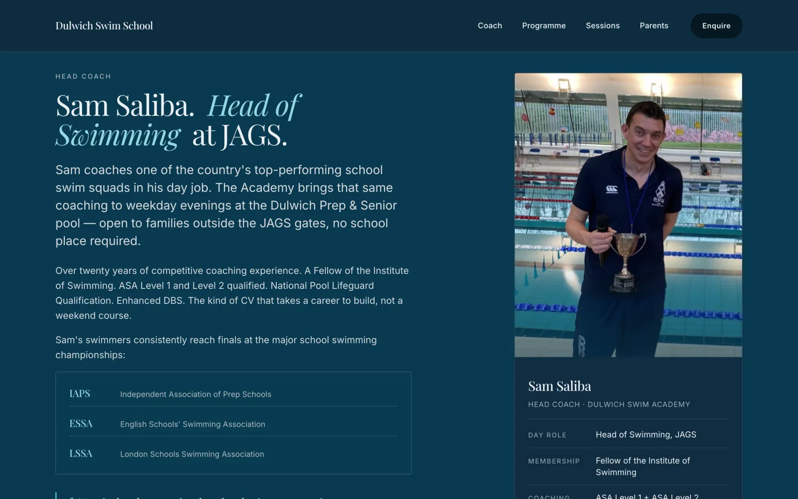
Sam Saliba is the Head of Swimming at James Allen's Girls' School — one of the country's top-performing school squads. He'd booked the lanes at Dulwich Prep & Senior for two evenings a week to launch his own after-school academy, open to any swimmer in SE London. There was no website, no booking system, no brand. There was a registration form, a Terms & Conditions document, and a summer-term letter to parents. Term started in three weeks.
Make the site feel like
the coach himself.
The pool is the headline.
Full-bleed photograph of a swimmer mid-stroke. Editorial Playfair Display + Inter. No marketing speak above the fold — just the academy name, the coach, the pool, and a single brass CTA to enquire.
Two satellite pages, one short homepage.
Programme detail and the full FAQ live on dedicated /academy and /parents pages. The mobile homepage links to them via brass bridge cards. Total mobile scroll dropped from 19 viewports to 12 — a 38% reduction without hiding any content from desktop.
The type is the brand.
Playfair Display variable italic for the headlines, Inter for the body. Mixed-weight headings, italic emphasis in brass-soft cyan. The type does the work an oversized logo would normally do. No stock illustration, no marketing-speak, no nine-section homepage.
Three pages on mobile,
one page on desktop.
Most local-business sites either ship one giant scrolling page on every device or ship a stripped-down mobile version that loses content. Dulwich Swim Academy ships both. Desktop is one long, dense page — programme detail, full FAQ, the lot. Mobile gets a focused homepage with two brass "open the full page" bridges that route to dedicated /academy and /parents pages. Same content, same SEO, half the perceived length.
-
Two satellite pages.
/academyfor the programme primer,/parentsfor the joining process and FAQ. Each with its own canonical, FAQPage and HowTo schema. -
Mobile-only bridges.
display: noneon desktop, full brass CTA card on mobile. Source order preserved for screen readers. -
Newspaper float for the coach.
Small portrait of Sam floats
left, body copy wraps around it, the quote clears below. DOM order swapped so float-left wraps naturally; desktop position preserved via explicitgrid-column. -
One stylesheet, one breakpoint.
Every mobile rule lives inside
@media (max-width: 719px). Desktop is provably untouched at every viewport ≥ 720px. -
Drawer outside the nav.
Backdrop-filter on the scrolled nav was creating a containing block that trapped the mobile drawer's
position: fixed. Moved to a<body>child — viewport-fixed at every scroll position. -
iOS hero lock.
min-height: 100svhnot100dvh, so the hero photo never re-crops when Safari's address bar collapses on scroll.
/* styles.css · mobile bridge pattern */

/* Default: hidden everywhere */
.parents-bridge,
.academy-bridge { display: none; }

@media (max-width: 719px) {

  /* Hide the long-form sections
     on the mobile homepage only */
  body.page-home .primer,
  body.page-home .process,
  body.page-home .faq {
    display: none !important;
  }

  /* Show the brass bridge cards
     in their place */
  body.page-home .academy-bridge,
  body.page-home .parents-bridge {
    display: block;
    background: var(--section-dark);
    padding-block: var(--s-7);
  }
}- Mobile scroll, before
- 15,474 px
- Mobile scroll, after
- 9,500 px
- Total reduction
- 38%
- Pages indexed
- 3 (Home + 2 satellites)
- Desktop layout
- Untouched
- JS for layout switch
- 0 KB
Five auto-advancing carousels.
Zero framework.
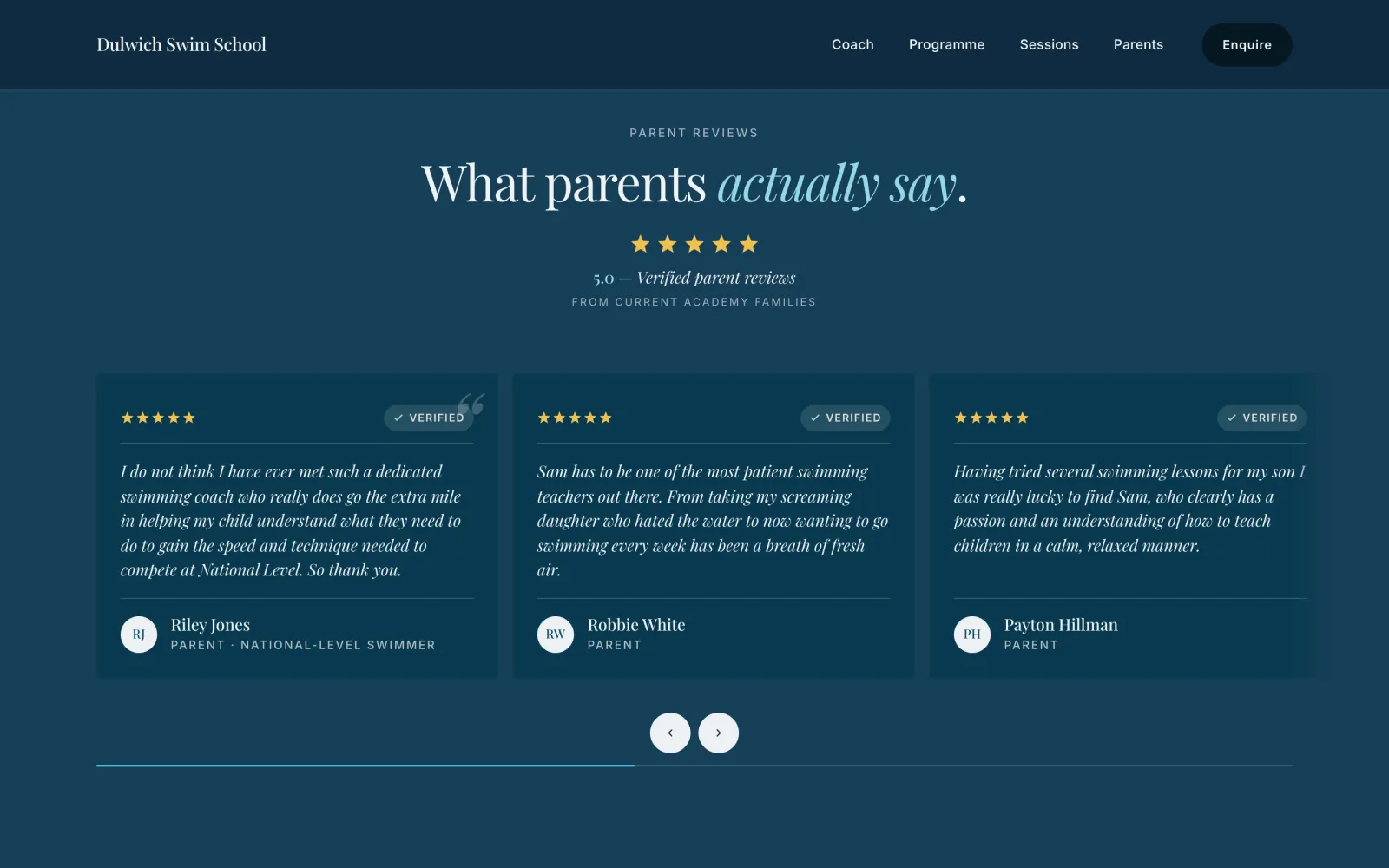
Every section that needs motion got the right kind. Continuous CSS marquees for trust strips and pool photos — no snap, no JS. Hamlet-pattern auto-advancing carousels for reviews and pool detail. Single-slot crossfade rotators for the mobile reviews. A swipe-and-snap for mobile pricing fits all three plans on one screen with no scroll. All under 5 KB of inline JavaScript, no framework, no Lenis, no GSAP.
-
CSS marquees, not JS loops.
Trust strip and pool photos use
@keyframeswithtranslateX(-50%). Items duplicated once via JS for a seamless seam. Pause on hover, respectprefers-reduced-motion. -
One reusable carousel function.
autoCarousel(opts)drives reviews, pricing, pool, and process. Pauses on touch + hover + offscreen.enabledFngates per-breakpoint — pricing only carousels on tablet, desktop is a static grid. -
Crossfade rotator on mobile reviews.
All four review cards stack in one grid cell. JS adds
.is-activeto one at a time. Brass dot indicators. Swipe-free. Calmer than a snap carousel for testimonials. -
Three-column pricing on mobile.
All three plans visible at once on a 375 px viewport. Tag, time, price, meta, button — tightened to fit ~110 px per card. Featured card stays navy-2; the others lift to
#163E58. -
Editorial pound sign.
£wrapped in a span using Inter at 0.55em, baseline-aligned to the Playfair digits. Lining figures + tabular numerals viafont-feature-settings. - Reduced-motion path on every animation. Marquees freeze, carousels pause, fades disabled. Content stays readable.
// One function, four carousels.
function autoCarousel(opts) {
  const { track, itemSelector,
          interval, enabledFn } = opts;

  const reduced = matchMedia(
    '(prefers-reduced-motion: reduce)'
  ).matches;

  function tick() {
    if (reduced || paused) return;
    if (!enabledFn() || !inView())
      return;
    elapsed += STEP;
    if (elapsed >= interval) {
      elapsed = 0;
      scrollByCards(1);
    }
  }

  setInterval(tick, STEP);
  track.addEventListener('touchstart',
    pause, { passive: true });
}- Carousels driven
- 5
- JS framework
- None
- Inline JS budget
- ~4 KB
- Pause signals
- 5 (touch, hover, focus, offscreen, reduced-motion)
- CSS-only marquees
- 2 (trust strip, pool)
- Mobile reviews mode
- Crossfade + dot indicators
Live in 12 days.
- 96
- Lighthouse, mobile
- 12days
- Brief to live
- 0
- Templates used
The site is live at dulwich-swim-academy.vercel.app (custom domain incoming). Three pages, one design system, no template anywhere on the page. The first parent enquiry came in within four days of launch.
If you run a local academy, studio, clinic or shop in Dulwich, East Dulwich, Herne Hill, Forest Hill, Peckham, Crystal Palace, or anywhere across South East London and your website isn't doing its job, get in touch. The process is the same. See pricing for the full breakdown.
Your business could be
case study 04.
Got a local practice, studio, club or academy that needs a proper website? I'm taking on new projects now.
Start a conversation